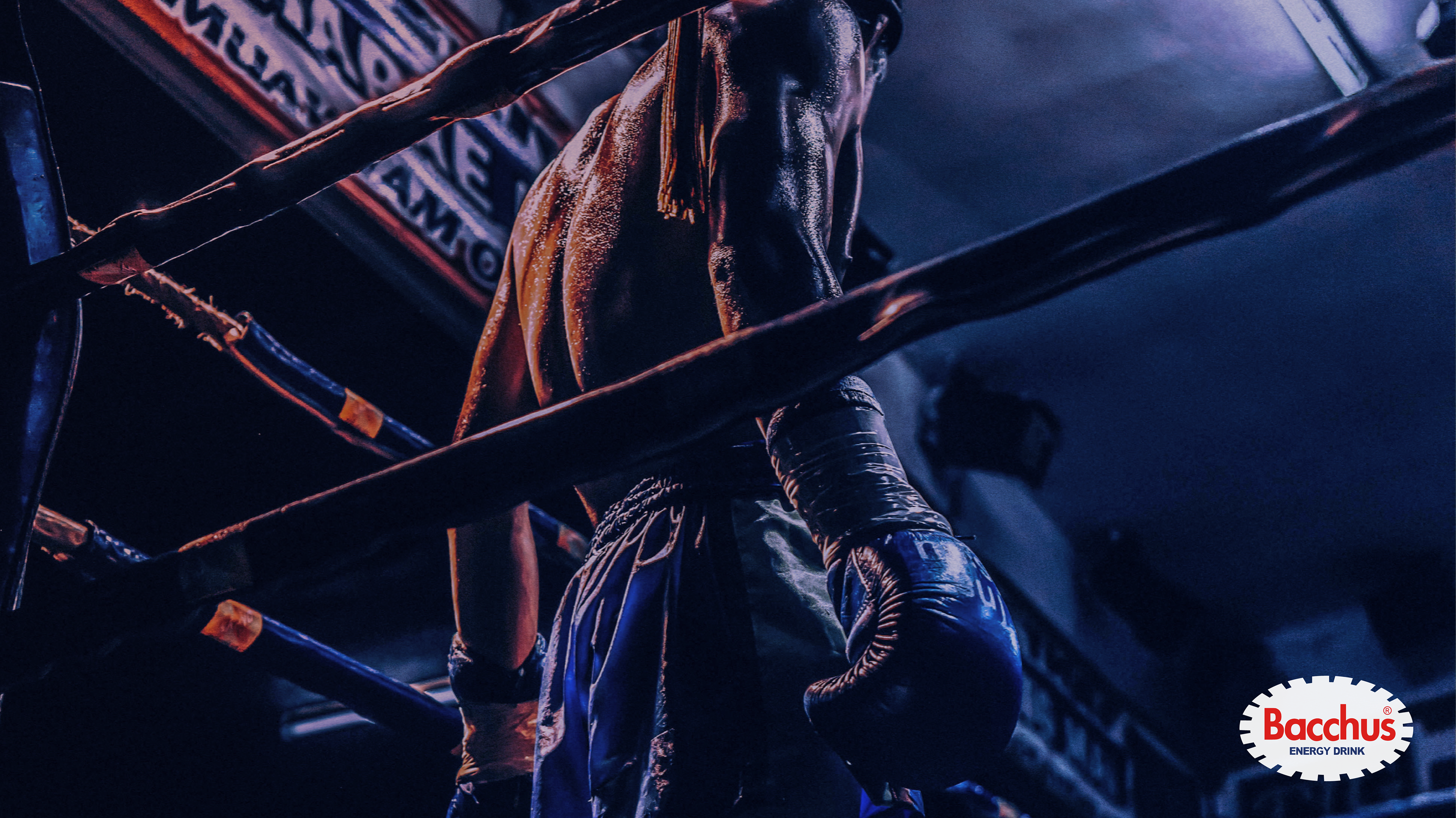

BACCHUS-D
Branding concept development
During my exchange in South-Korea, I developed a branding concept for Bacchus-D. For those who are not familiarized with this drink, it's an energy drink. Let me tell you how I discovered it.
The first couple of days I stayed in Korea, the weather was really cold and I started to get sick. A korean friend of mine told me to buy a vitamin drink in the convenience store, so I could feel better. I got to the so-called "C-U" (that's the name of the store) and went to the fridge to find four shelves full of different brands of various vitamin drinks. My vast knowledge of korean at that time was "hello" and "goodbye", so figuring out what was what, would've been really hard.
Instead, I took a little blue labeled bottle and, after drinking it, I felt great and active again. I bought this drink for the next three days and, after that, every five or once a week. Until in one of my creative classes, we were given the task of choosing a brand and remaking its label design. I chose this marvelous blue labeled bottle, called Bacchus-D, as I was deeply thankful. It was, to my surprise, no vitamin C or anything that could heal me during my sickness, it was in fact an energy drink.
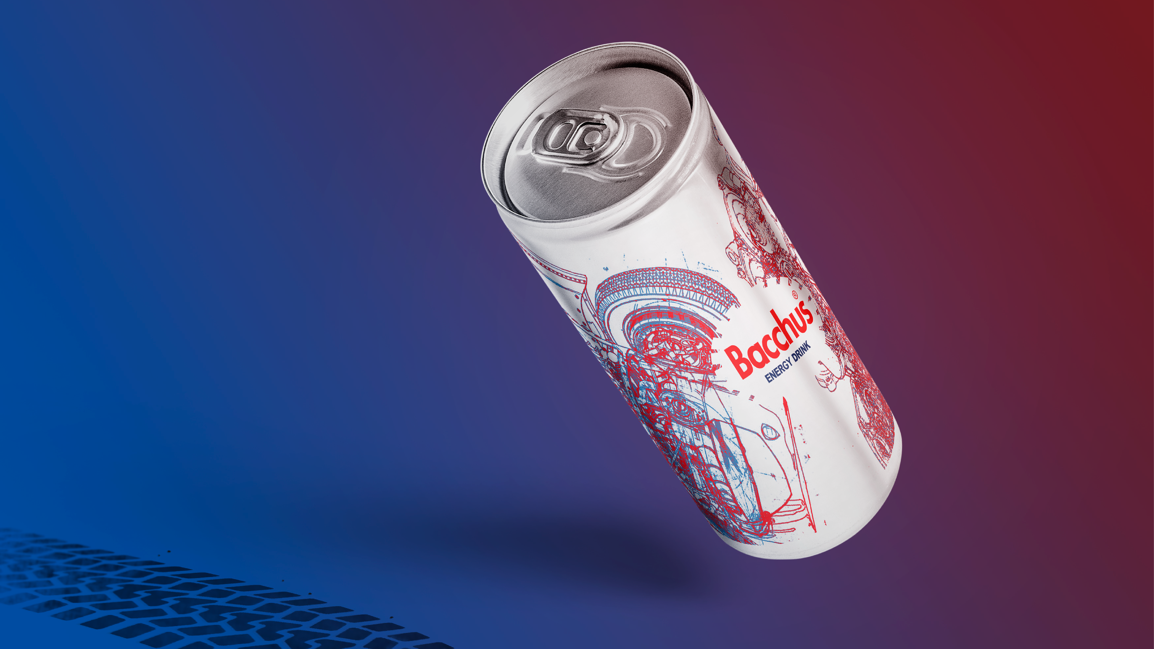
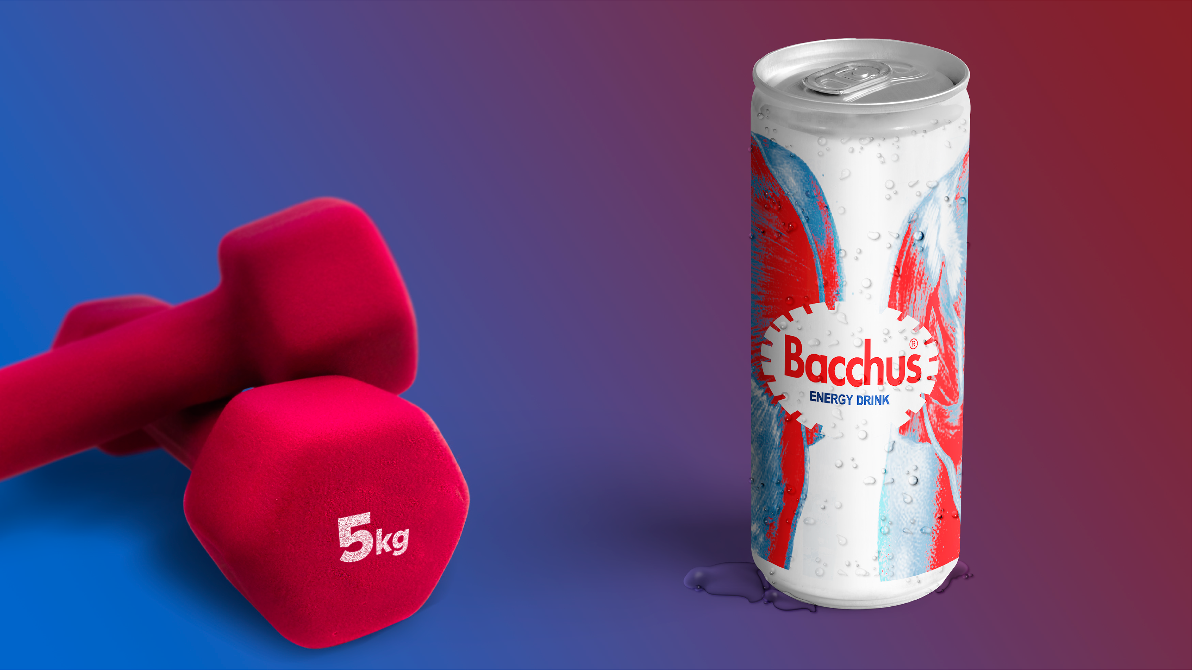
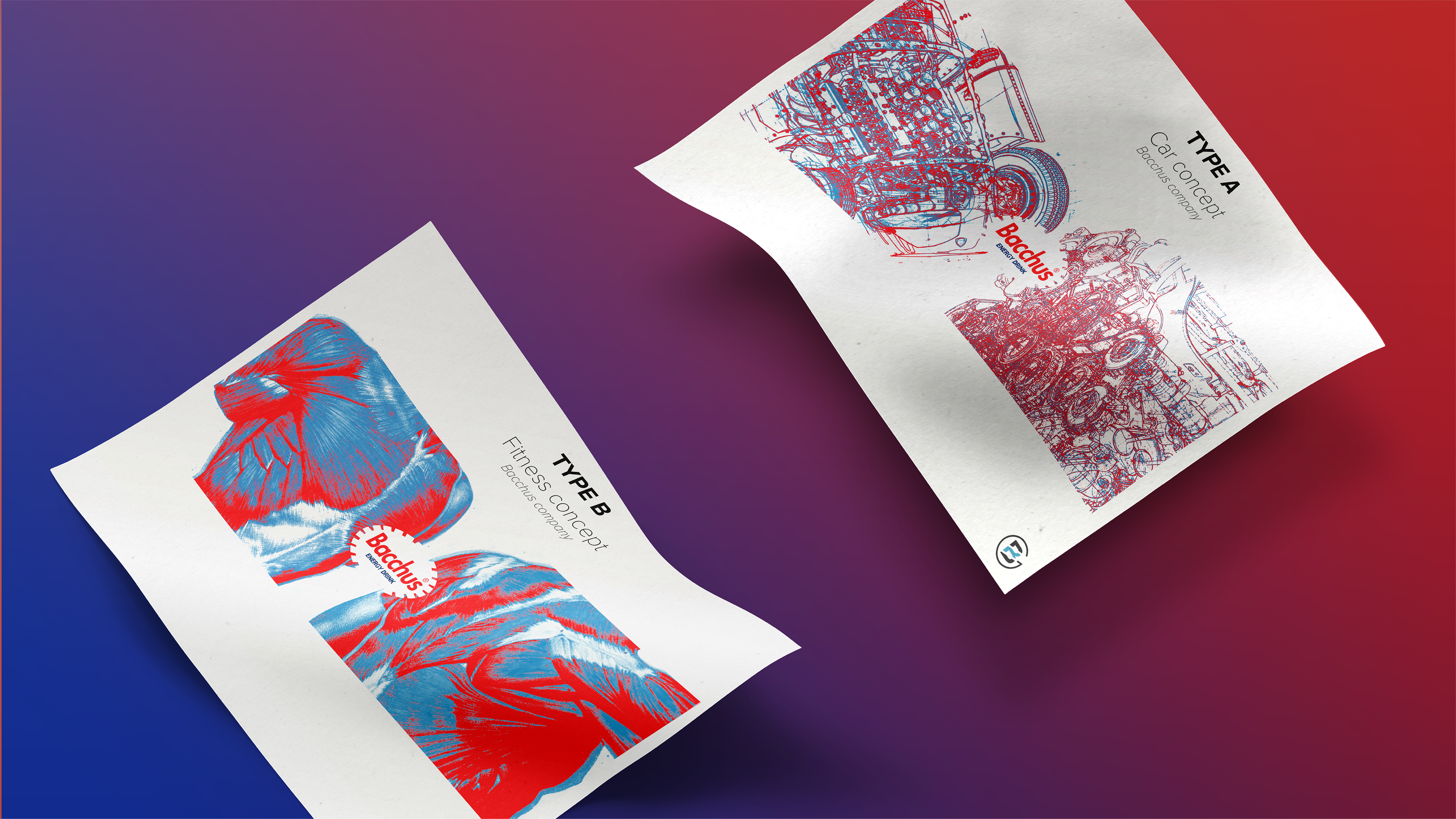
The bottle needed to be clearer. Bacchus needed to talk about its true nature. It's such an awesome energy drink that it almost feels like medicine.
Thanks for reading! Hope you liked it.